
For generations, millions of people have learned geography from a familiar rectangular world map. Europe sits prominently near the top, Greenland looks enormous, and Africa appears surprisingly small compared with regions farther north.
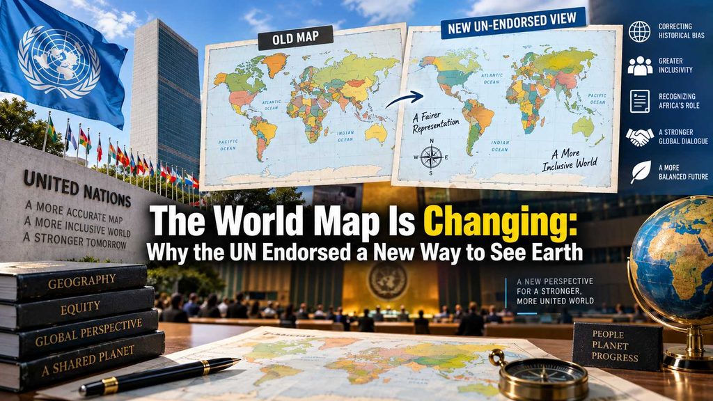
But there is a problem with that familiar picture.
It is not an accurate representation of the relative size of the world’s landmasses.
On September 4, 2026, the United Nations General Assembly endorsed the Equal Earth projection, a map designed to represent the areas of continents more proportionally. The resolution, known as the “Correct the Map” initiative, passed with 164 countries voting in favor, one against and six abstaining.
The decision does not mean that the old Mercator map has suddenly become illegal or that every map in the world will be replaced overnight. Instead, it encourages wider use of a different projection for general purposes.
And that distinction matters.
The real story is not that the United Nations has discovered a single “correct” map. It is that the organization has endorsed a different way of showing the planet—one that makes the relative size of Africa, South America and other regions much easier to see.
Why Does the World Map Look Different From Reality?
The Earth is a sphere.
A map is flat.
That simple problem has challenged cartographers for centuries.
Imagine trying to flatten the peel of an orange without stretching, tearing or changing its shape. Something similar happens when cartographers transform the curved surface of Earth onto a flat sheet.
Different map projections solve the problem in different ways.
Some preserve directions. Others preserve distances. Some attempt to preserve shapes, while others prioritize the relative area of countries and continents.
There is no flat world map that can preserve everything perfectly.
The famous Mercator projection, developed by Gerardus Mercator in 1569, was particularly useful for navigation because it preserves angles and makes plotting certain sailing routes easier. But its representation of land area becomes increasingly distorted toward the poles.
Greenland Is the Classic Example
One of the easiest ways to understand the problem is to compare Greenland with Africa.
On many Mercator-based maps, Greenland looks comparable in size to Africa.
In reality, Africa is roughly 14 times larger than Greenland.
That is a striking difference.
The same distortion affects other northern regions. Countries and territories located farther from the equator can appear dramatically larger than their actual surface area.
Africa, meanwhile, loses visual prominence despite being the world’s second-largest continent by land area.
The Equal Earth projection is designed to address precisely this issue.
What Is Equal Earth?
The Equal Earth projection was developed in 2018 by cartographers Tom Patterson, Bernhard Jenny and Bojan Šavrič.
Its central goal is to preserve the relative area of landmasses more accurately while producing a world map that remains visually familiar and practical.
Instead of making countries near the poles appear increasingly oversized, Equal Earth keeps continental areas much closer to their real proportions.
That means Africa looks much larger relative to Europe and Greenland, while South America also gains the visual scale it has in reality.
The result can feel surprising to anyone accustomed to Mercator.
But the surprise comes from seeing proportions differently—not from the continents themselves changing.
The UN Is Not “Replacing” Every World Map
This is where some headlines can be misleading.
The UN General Assembly has endorsed Equal Earth, but the resolution does not impose a worldwide legal requirement that governments, companies, schools or websites immediately abandon Mercator.
The UN itself continues to publish different kinds of maps for different purposes. Its geospatial department, for example, publishes world maps and specialized geographic products depending on their intended use.
The new resolution instead encourages the use of Equal Earth in areas such as education, media and digital mapping.
So you should not expect every navigation app, atlas or website to suddenly change its map tomorrow.
Why Africa Is at the Center of the Debate
The campaign behind the UN resolution was strongly promoted by African countries, with Togo playing a leading role and the African Union backing the initiative.
For supporters, the issue is not merely technical cartography.
They argue that maps influence how people understand the world.
If generations of students repeatedly see Africa represented as smaller than it actually is, that visual impression can become deeply embedded in people’s understanding of geography.
The campaign therefore connects cartography with representation and historical perceptions.
But that interpretation is contested. Some experts emphasize that Mercator was created primarily for navigation and that its distortions are a mathematical consequence of the projection rather than proof that its designer intended to diminish Africa. Equal Earth itself is also not “perfect”; it makes different compromises because no flat projection can preserve every geographic property simultaneously.
The History Behind Mercator Matters
Mercator’s map was created more than four centuries ago, long before satellites, digital mapping and modern geographic information systems.
Its great strength was navigation.
A sailor could use the projection to plot a course using constant compass bearings more conveniently.
That purpose is important because it explains why Mercator became so influential.
The map was not originally designed to provide an accurate comparison of the sizes of countries and continents.
Problems arise when a projection designed for one purpose becomes the default visual representation of the entire planet.
It is similar to using a road map to compare the populations of cities. The map may be excellent for finding a route, but it was not designed to answer that question.
A Different Map Can Change What We Notice
Look at an Equal Earth map and Africa immediately commands more visual space.
South America appears larger than many people may expect.
Greenland shrinks dramatically.
Northern Europe and Canada also lose some of the exaggerated scale they acquire on Mercator.
None of these places has physically changed.
The map has changed the way the information is displayed.
And that is why the debate has attracted attention far beyond the world of cartographers.
India Also Has a Stake in the Discussion
The UN decision has also drawn attention in India because map projections and political boundaries are separate issues.
India supported the resolution in principle but also reiterated its position regarding the depiction of its international boundaries, particularly concerning Jammu and Kashmir and Ladakh.
That highlights another important distinction.
A map projection determines how the curved Earth is transformed onto a flat surface.
It does not, by itself, settle disputes over international borders.
Changing the projection does not automatically change sovereignty, territory or legal boundaries.
The United States Was the Only Vote Against
The resolution passed overwhelmingly, but it was not unanimous.
The United States voted against it, while six countries abstained.
The disagreement illustrates that even something as seemingly technical as a world map can become connected to larger debates over history, representation and international politics.
Supporters view the change as a way to improve geographical accuracy and representation.
Critics have questioned whether the initiative gives too much political meaning to a technical cartographic issue.
Both sides, however, are debating something real: how the visual presentation of geographic information influences what people see and understand.
Will Google Maps and Other Apps Change?
Not necessarily—and certainly not immediately.
Digital mapping services use different projections depending on what they are trying to accomplish.
Online navigation commonly favors projections that work well for local positioning and interactive maps. A global educational map has different requirements.
The UN resolution therefore does not mean that navigation systems must abandon the projections they currently use.
Instead, Equal Earth could become more common in classrooms, textbooks, reports, news graphics and other places where comparing the size of continents is important.
There Is No Perfect World Map
Perhaps the most important lesson from this controversy is that every world map involves compromise.
Mercator preserves angles and is useful for navigation.
Equal Earth provides a more proportional representation of land areas.
Other projections prioritize different characteristics.
So asking which map is simply “correct” misses the deeper issue.
The better question is: Correct for what purpose?
If the goal is comparing the size of continents, Equal Earth has an obvious advantage.
If the goal is certain forms of navigation, Mercator remains useful.
The projection should match the job.
A Map Can Be Technically Accurate and Still Shape Perception
That is what makes the UN decision interesting.
A map is not just a collection of borders and coastlines. It is also a visual framework through which people learn about the planet.
For a child seeing a map in a classroom, the relative size of continents can influence their basic geographic understanding.
For news organizations, maps can affect how audiences perceive conflicts, trade routes and global regions.
For policymakers, geographic visualization can influence how information is communicated.
The physical world remains unchanged, but the picture in people’s minds can change dramatically.
What the UN Decision Really Changes
The September 4 resolution is unlikely to transform the world’s maps overnight.
Mercator will remain in use. Navigation charts will continue to require specialized projections. Digital platforms will choose mapping systems based on their technical requirements.
But Equal Earth now has a significant new endorsement.
The UN vote gives governments, educators, publishers and media organizations another reason to reconsider which projection they use when the goal is to show the world’s geography as proportionally as possible.
That may ultimately be the most important consequence.
The world itself has not been redrawn.
Our picture of it has.
And perhaps the most surprising thing about the new map is not that Africa suddenly looks bigger or Greenland suddenly looks smaller.
It is realizing that they were always that size.


